
Pennsylvanians Organized to Witness, Empower, and Rebuild, also known as POWER enthusiastically approached Indavisual Media about a total rebrand for their civic nonprofit POWER Interfaith and its sister org POWER Action Fund going into 2025. They sought a more modern brand aesthetic and website overhaul that aligned the POWER logo identities with the organization’s ethos of faith, justice and community. They eagerly sought updated brand colors and dimensions that would reflect modern values, moral courage and civic action.
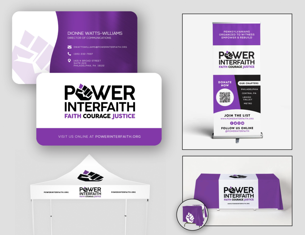
Furthermore, there was a need to develop all-new brand collateral and an array of branded print material to correspond with the refreshed brand look and styling.
THE WORK
Indavisual Media handled LOGO DESIGN, COLLATERAL DESIGN, and WEBSITE DEVELOPMENT from concept to completion. We also managed all PRINTING jobs from spec to delivery.
THE PROCESS
We aimed to develop a brand that was clean, clear and distinct; one that would visually establish POWER as an exciting, forward-thinking authority on progressive, multi-faith and multiracial grassroots organizing. Our approach was to absorb the true mission and vision of the organization, fully understand their goals and history, and cultivate an effective brand strategy based upon target audiences and industries — all this with a brand story that would excite leadership and staff.
Our efforts unfolded in several steps, starting with virtual meetings, brand questionnaires, proposals, design briefs, technical briefs, and strategic timelines for deployment.
After a successful rebrand and relaunch, we continue to work with POWER on web strategy and ongoing maintenance as their work evolves and as their branding needs grow.
DESIGN STORY
This logo is inspired by POWER‘s strong moral courage and tenacious grassroots organizing. The design story began with references to symbolism from protest movements throughout history. We followed with bold display fonts in capital letters, casting allusions to protest signage from the 1970s. A distinctive letter ‘W’ uses retro styling to conjure feelings from that critical era. The crisscrossing lines of the signature ‘W’ symbolize the intersectionality of POWER‘s various campaigns while also paying tribute to the original POWER logo.
The abstract ‘fist’ is the nucleus of the new POWER brand. It represents agitation, conviction, and various movements for social change. We chose to combine the fist symbol and the wordmark by replacing the letter “O” in POWER. Incorporating this potent iconography directly into the word serves as an exclamation that ‘power’ in fact belongs in the hands of the people. This added emphasis is streamlined, versatile, distinctive and memorable. It creates a visual language for audiences to immediately associate POWER with people, protest and political action.
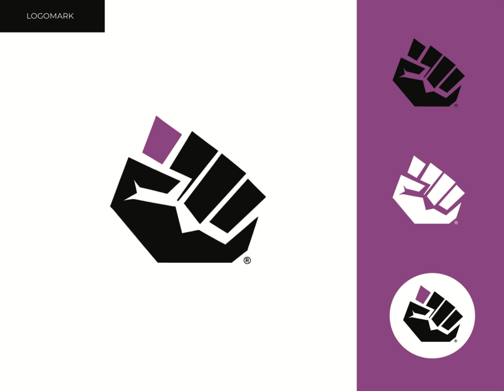
The design of the fist evolved from very abstract to moderately abstract, ensuring clarity. This fist design also smoothly mirrors the bold display font in which it is incorporated.
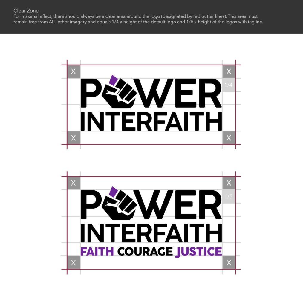
Adding to the visual story of POWER‘s mission, we incorporated the full organization name into the main logo: ‘POWER Interfaith‘. We also added a new 3-word tagline: “Faith Courage Justice”. This spotlights the organization’s multi-faith coalition and progressive mission. These three words were suggested by POWER‘s Director of Communications and come from page one of the Design Brief (‘Our Goals’).
COLOR STORY
Purple is a color of honor, compassion, cooperation, creativity, nobility, royalty, peace, magic and spirituality. It balances the stimulation of red and the calm of blue. In many religions, purple often symbolizes the majesty of God, redemption through God, penance and renewal. Even in modern meme culture, religious emojis are all colored purple (Christian, Muslim, Buddhist, Jewish, Hindu, Daoist).
We experimented with very youthful and trendy shades of Deep Magenta as well as more stoic, classic Royal Purple hues. We ultimately chose a Manganese Violet that is bright and contrasting. This effectively plays off the strong and timeless black base of the logo. This shade leans into ‘Purple’ without being dull or veering too far into playful, brighter hues.
While most related organizations rely on reds and blues, Manganese Purple is a signature color that differentiates POWER in the market. It is a flexible shade that allows the brand to incorporate other eye-catching colors on assets and campaigns, or to cast all-purple motifs around the logo, since it is only used sparingly on the symbol and tagline.